Market Snapshot Part 1: The Scatterplot
Visualizing Market Data

In the Market Snapshot series, I aim to introduce traders to practical ways of analyzing large amounts of data quickly, helping them better understand market conditions in real time.
As traders, we’re often required to process vast amounts of information and extract insights simultaneously.
Questions arise, such as:
- Is the market in a bullish or bearish phase?
- Are we seeing contraction or expansion?
- How does each stock relate to the market as a whole?
- Is the stock an outlier, or moving in sync with the broader trend?
To answer these questions properly, you’d typically spend a fair amount of time digging through price action, indicators, and correlations. But by the time that process is complete, the opportunity might have passed or the market may have already entered a new phase.
As humans, we’re naturally better at recognizing visual patterns than parsing large tables of numbers. So the real question becomes:
What visual tools can summarize this data effectively, without oversimplifying or relying too heavily on derived metrics?
One visualization tool that answers this question is the Scatter Plot Chart. It offers structure without sacrificing raw data. I will first start by explaining what a scatter plot is and then provide a method for incorporating it into your trading process.
What is a Scatterplot

A scatter plot is a chart that places data points along two axes, one on the horizontal (x-axis) and one vertical (y-axis) to show how each item compares across two dimensions. In our case, each point represents a stock, with one variable on the x-axis and another on the y-axis.
When you plot multiple stocks, patterns begin to emerge that reveal:
- Where most stocks are concentrated
- Which stocks are calm vs. volatile
- Which stocks are trending vs. lagging
- Which names are outliers worth investigating
Instead of sifting through rows of numbers, you can immediately see how things relate through patterns. It’s a fast and intuitive way to grasp complex market dynamics.
Setting Up the Scatter Plot
Defining Variable
A well-constructed scatter plot can reveal market conditions at a glance. The key lies in selecting variables that meaningfully capture price behavior and volatility.
 In this setup, we use:
-
Price Return – Reflects directional movement
- Positive values → Bullish momentum
- Negative values → Bearish pressure
-
Range Spike – Measures volatility based on how much a stock deviates from its typical range
- Range Spike ≤ 1 → Calm, low-volatility environment
- Range Spike > 1 → Heightened volatility
Classify Market Condition
Once we’ve defined our variables, we can classify stocks into distinct behavioral quadrants:
-
Bullish / Non-Volatile
Positive returns + low volatility
→ A stable bullish trend with minimal price fluctuations -
Bullish / Volatile
Positive returns + high volatility
→ A bullish market experiencing increased price swings -
Bearish / Non-Volatile
Negative returns + low volatility
→ A slow, steady downtrend -
Bearish / Volatile
Negative returns + high volatility
→ A turbulent, unstable bearish phase
We also define a Flat Market Zone:
Price Return between -2% and +2%, with Range Spike ≤ 1.
This neutral area captures periods of muted price action and low directional bias.
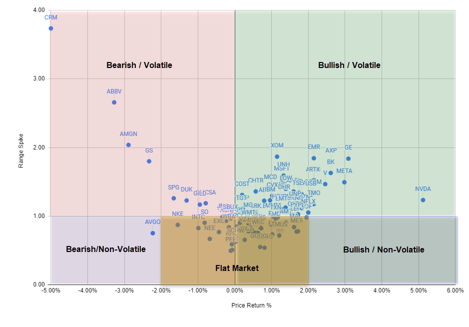
Interpreting the scatterplot

In our example scatter plot of the S&P 100, we observe that the majority of stocks cluster within a Range Spike of 0.5 to 1.9 and Price Returns between -1% and 2.5%. This data reveals the following insights:
Stable Market:
The Range Spike values between 0.5 and 1.9 reflect moderate volatility. This suggests most stocks are experiencing typical price fluctuations — not excessively calm, but not wildly volatile either. In short: the market shows signs of relative stability.
Neutral to Slightly Bullish Returns:
With Price Returns ranging from -1% to 2.5%, we see a mixed performance. Some stocks have declined slightly, while others have posted modest gains. This points to a neutral to mildly bullish market sentiment — no strong directional bias, but a gentle upward tilt.
Outliers:
A few notable stocks lie far from the cluster:
CRM, with a high Range Spike near 4, shows extreme volatility.
NVDA, with a Price Return near +5%, indicates strong bullish momentum.
ABBV, AMGN, and GS display elevated volatility alongside negative returns, suggesting bearish and turbulent trading activity.
Market Note
The scatter plot is a simple yet powerful trading tool, as with most good things in trading. When used as part of a dashboard, it gives you an instant snapshot of market behavior, even if you’ve been away from your screen for a while.
That’s a real edge!
With just a glance, you can spot volatility clusters, directional bias, and outliers. From there, it’s easy to dive deeper into individual stocks that meet your trading criteria.
Be safe out there, and…
Happy Trading!