Using Price Range to Gauge Intraday Performance
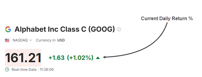
When analysing a stock’s intraday performance traders often rely on the current daily return ( The change in price relative to the previous day’s close expressed as percent) as a quick summary of whether a stock is up or down. While this metric is easy to reference, it fails to provide context into how the price is performing in relation to its high and low which can lead to misleading conclusions.
For instance, consider a scenario where a stock has a positive gap open, reaches a daily high, and then trades near the daily low but still ends up above the previous day’s close. In this case, the current daily return would indicate that the stock has generated a positive return from the previous day’s close, which may suggest a good performance. However, in reality, much of the day’s action was bearish, and the price closed far from its intraday high.
 This disconnect highlights a critical limitation: Daily Return% doesn’t tell us where the current price sits within the day’s range.
A Better Lens: Intraday Position Within the Range
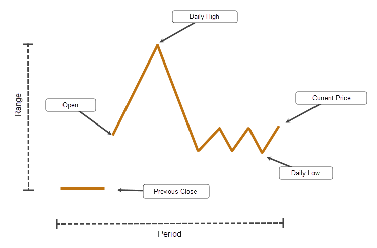
To get a clearer picture, it’s helpful to evaluate where the current price sits within the day’s true range. This gives you a sense of intraday strength or weakness, regardless of how the stock compares to the previous day.
This concept is captured by a simple but powerful metric called the Current Price Relative to Daily True Range. It shows how far the current price has moved within the day’s range, adjusted for overnight gaps, giving a clearer view of intraday positioning.
How It Works
The metric is calculated by subtracting the True Low (the lower of today’s low and yesterday’s close) from the Current Price, then dividing by the Daily True Range (the difference between the True High and True Low).
Formula:
((Current Price – True Low) / Daily True Range) x 100
Example:
If the current price is 50, the true low is 48, and the daily true range is 4:
((50 – 48) / 4) x 100 = 50%
That means the price is sitting halfway between the day’s low and high.
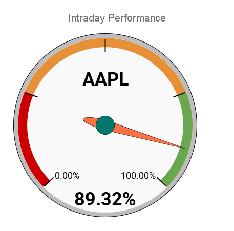
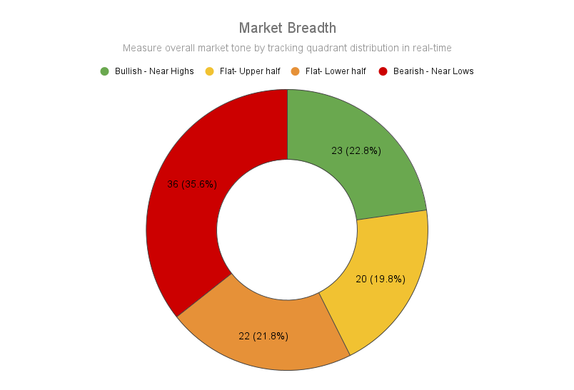
Quadrant-Based Range Analysis
Once you have the range percentage, you can segment it into four quadrants to interpret price behaviour more intuitively:
| Quadrant | Range Position | Interpretation | Sentiment zones |
|---|---|---|---|
| Q1 | 0–25% | Near lows - potential weakness or accumulation | Bearish |
| Q2 | 25–50% | Lower half - indecisive or fading | Flat |
| Q3 | 50–75% | Upper half - indecisive or building strength | Flat |
| Q4 | 75–100% | Near highs - potential momentum or exhaustion | Bullish |
Visualizing It Across Your Workflow
-
Individual stocks: A simple gauge or dial helps assess strength or weakness at a glance.
-
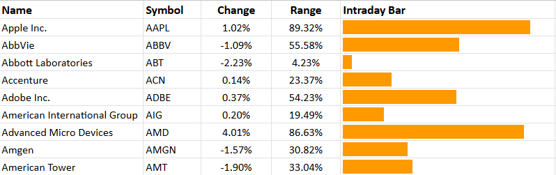
Watchlists: Display each stock as a row in a compact table with a horizontal bar showing its intraday range position.
-
Market breadth: Summarize the distribution of all stocks in a pie chart or percentile histogram, showing how many names fall into each range zone.
Markets move fast, but price always leaves clues. Looking at where a stock sits within its daily range is one of those simple tools that adds context without clutter. It won’t replace your core signals, but it can sharpen your read, especially when scanning multiple names.
Happy Trading!